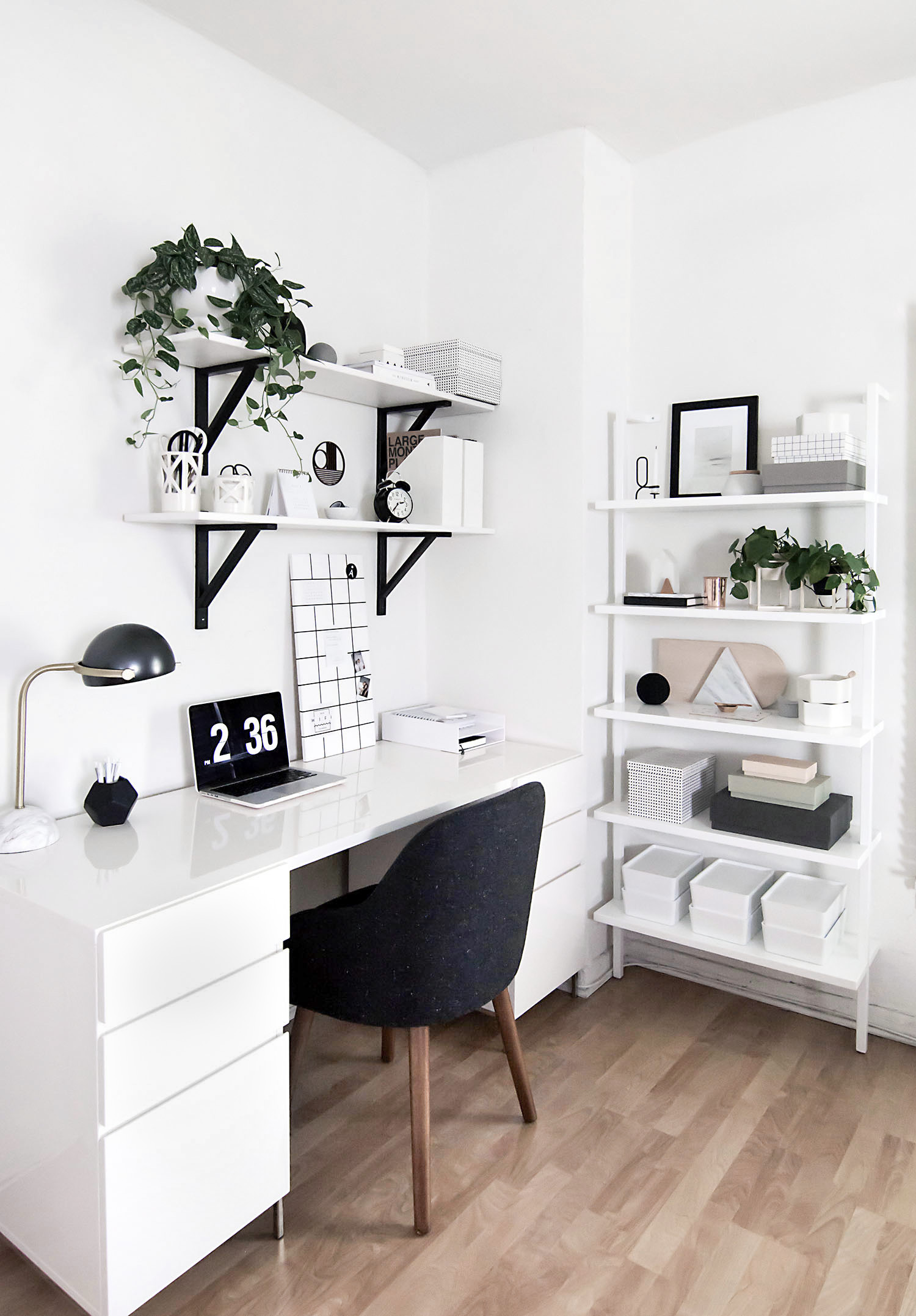
Well, this is it guys! This is where I spend the majority of my working days drafting ideas, editing photos, and writing blog posts. It’s totally accurate for you to picture me sitting in that chair right now as you’re reading this.
For a while this space had become overgrown with clutter and fallen apart as my style changed and I became uninspired by the scenery. A workspace redesign was not only badly needed to make me want to work in this corner of my living room again (instead of the sofa), but to also improve storage options and function while still achieving that monochrome minimalism I’m so obsessed with.
I’m essentially relieved to finally be able to share this with you because it’s been very, very hard to contain my excitement about it. The space finally looks like me and it’s finally really comfortable to work in. To add on to the excitement, West Elm partnered with me to make this redesign possible, which is an absolute dream and really cool to bring our style-mesh to life.
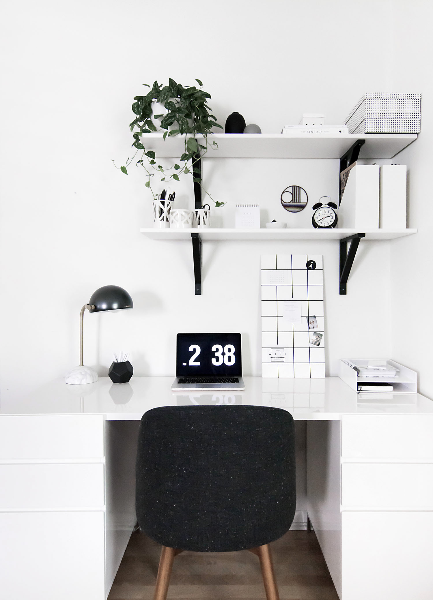
I’d say if there was one hero here, it would be the desk. It’s almost twice the width of my previous one and has more than twice the storage capacity with the double file cabinets. The extra desk top space is SO NICE since I’m the type that likes to write and draw on sprawled out papers while being able to refer to my open planner and notebooks and laptop at the same time while also having a plate of food nearby with a glass of water and a green juice. Space is nice, that’s all.
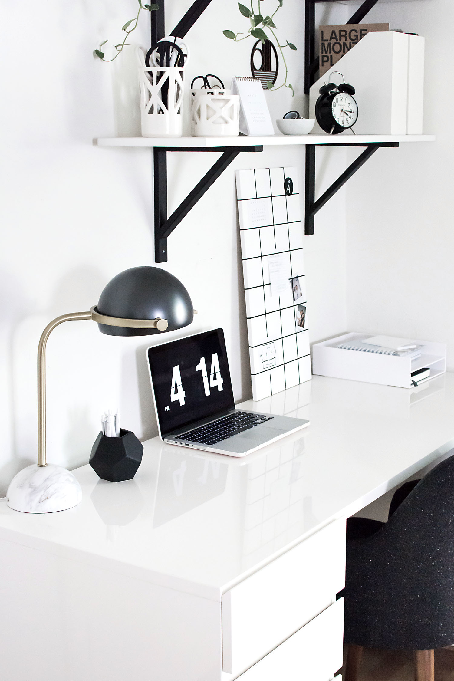
The shelves above the desk were there previously only I switched things up this time by painting the brackets black (they were gold before. Remember when I’d paint everything gold?) and replacing the shelves with white ones.
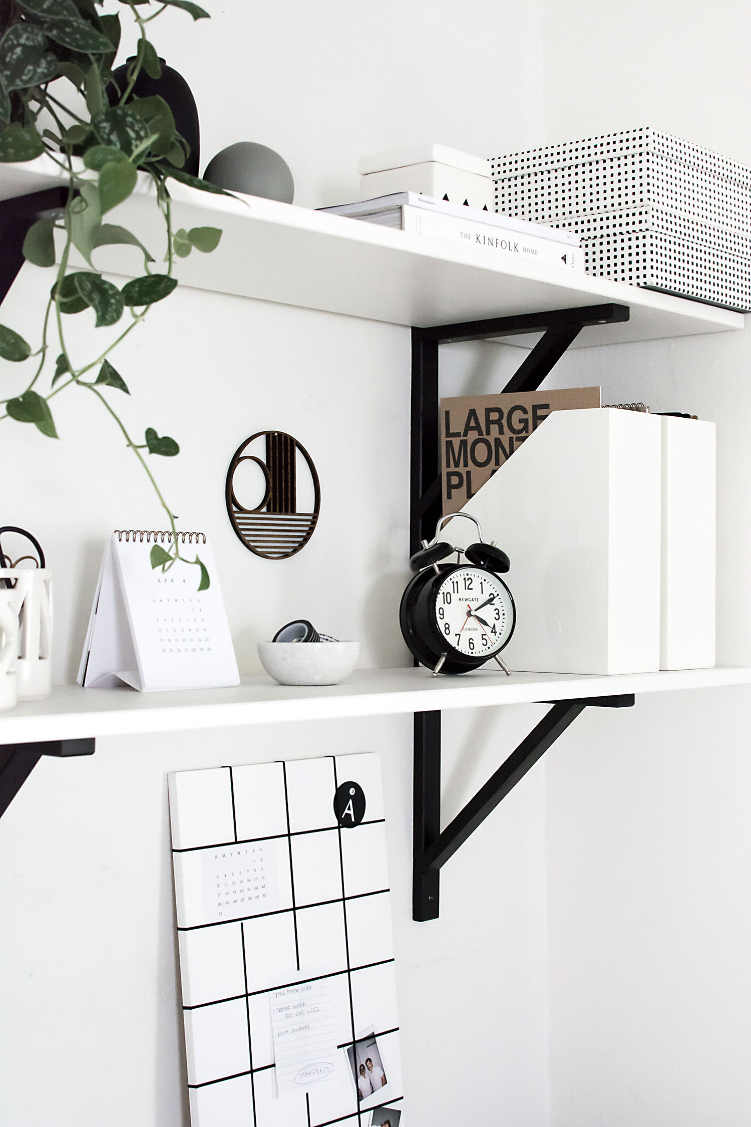
I wanted to keep these shelves as clutter-free and minimal as possible while still storing some desk essentials, which these lacquer magazine holders are helping me do perfectly. Also, when I used to imagine what my workspace makeover would look like, I remember visualizing an alarm clock just like this one being in the scene, which is a weird detail to know so far ahead of time but I find it adorable and best of all useful since it’s the only clock in our living room. Hard to read from afar, sure, but it’s there!
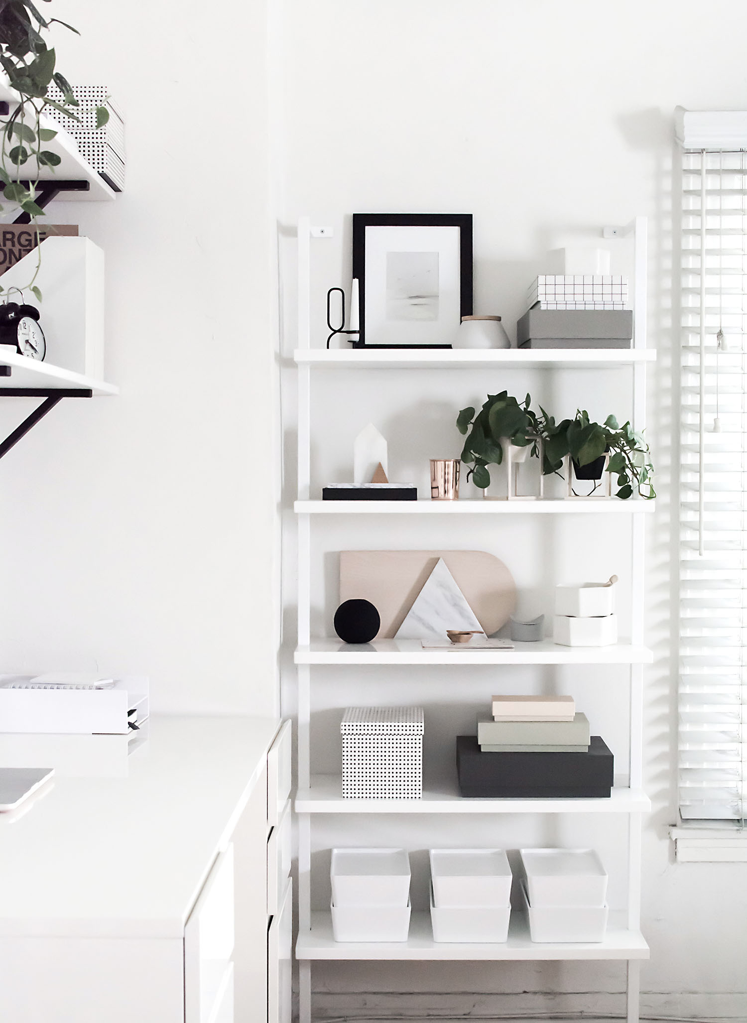
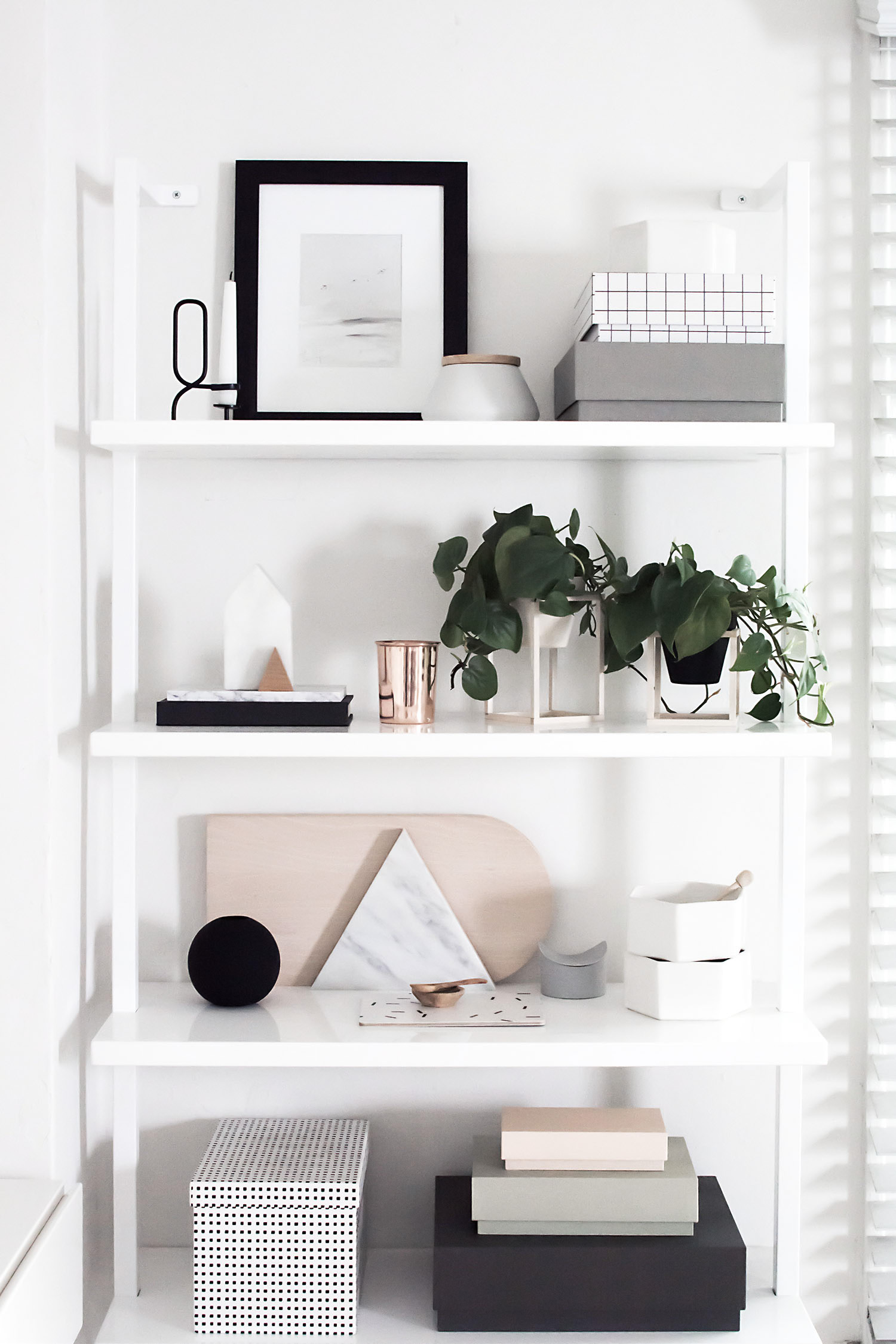
The bookcase next to the desk is where I’m storing some materials, props, and other knick knacks, a lot of which is stashed away in all those boxes.
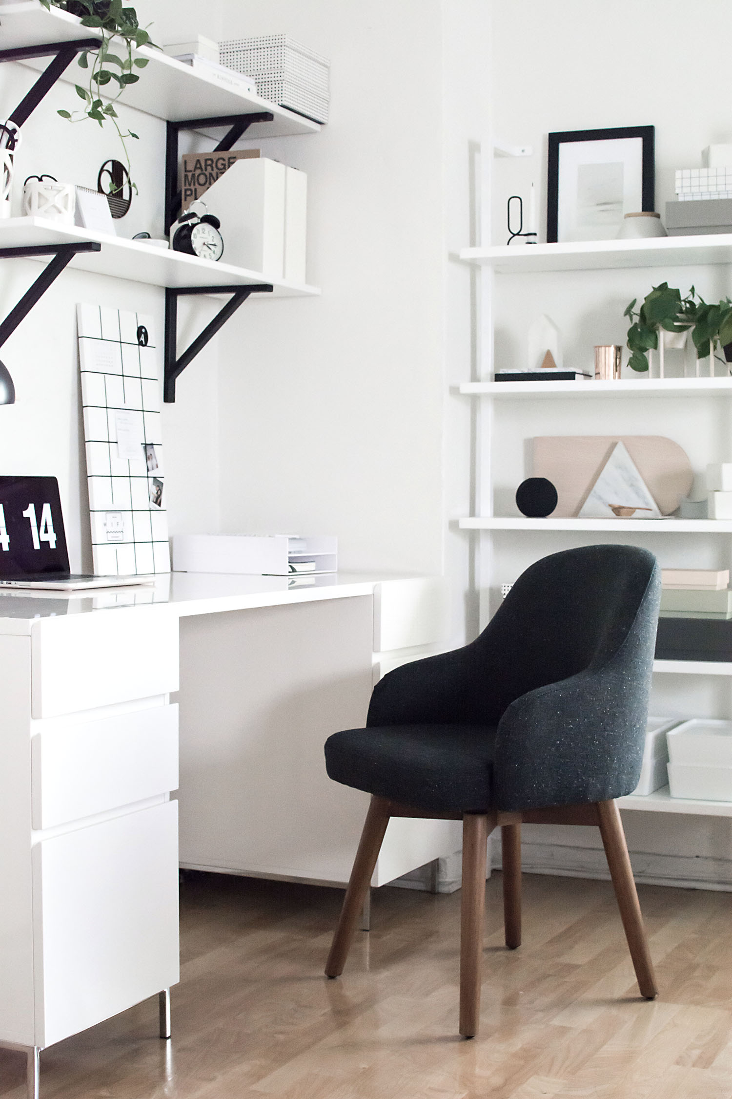
I had a ghost chair before, which I favored for being way more comfortable than expected, but it wasn’t sit-for-6-hours-straight comfortable. This chair is, and it’s surprising because at first sit I thought it was too firm but it turned out to be perfect for me. I love the simple shape, clean lines, color, everything.
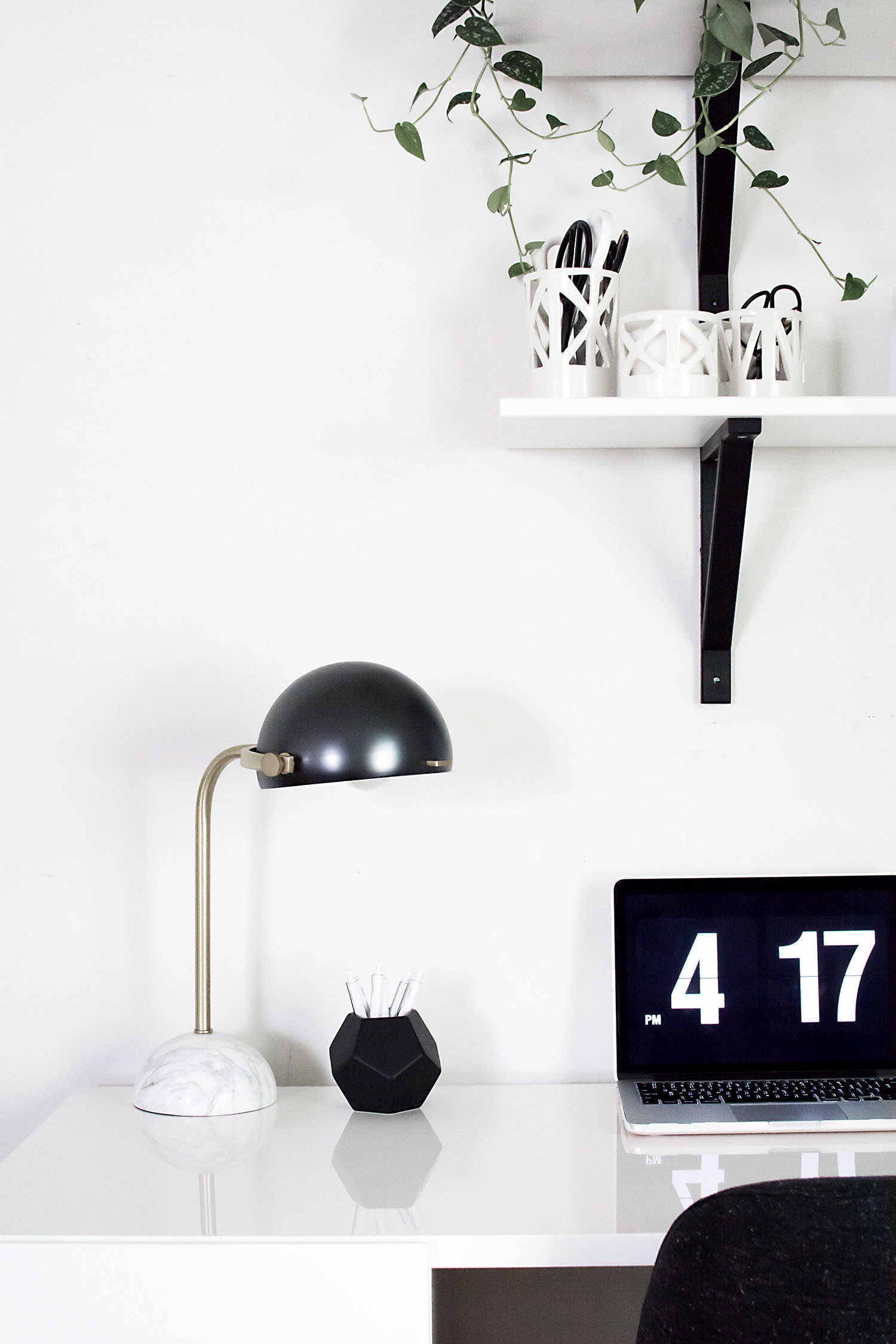
The lamp felt like the missing piece of the puzzle. Marble and bronze are never not a favorite around here. No question it was meant to live on my desk.
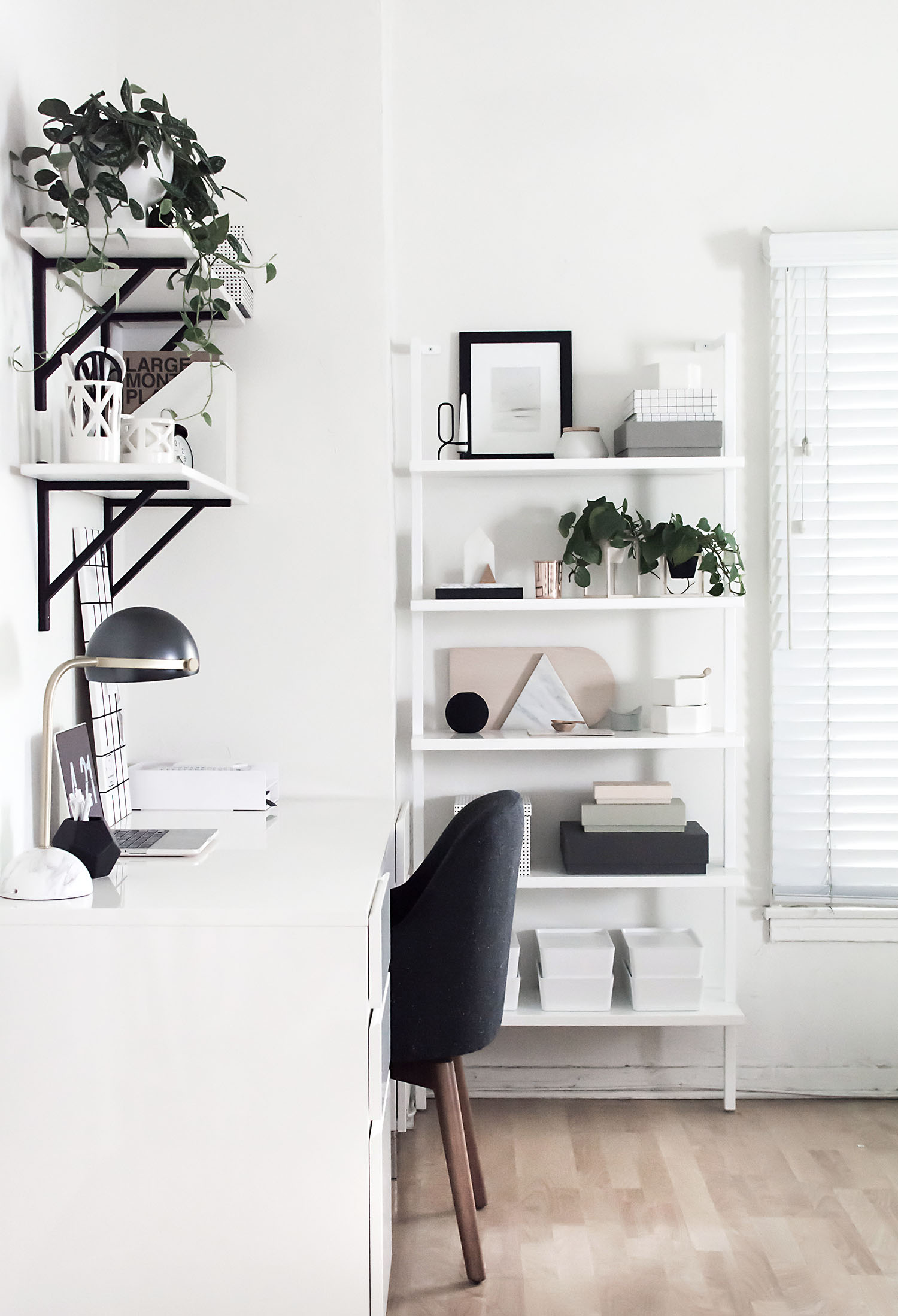
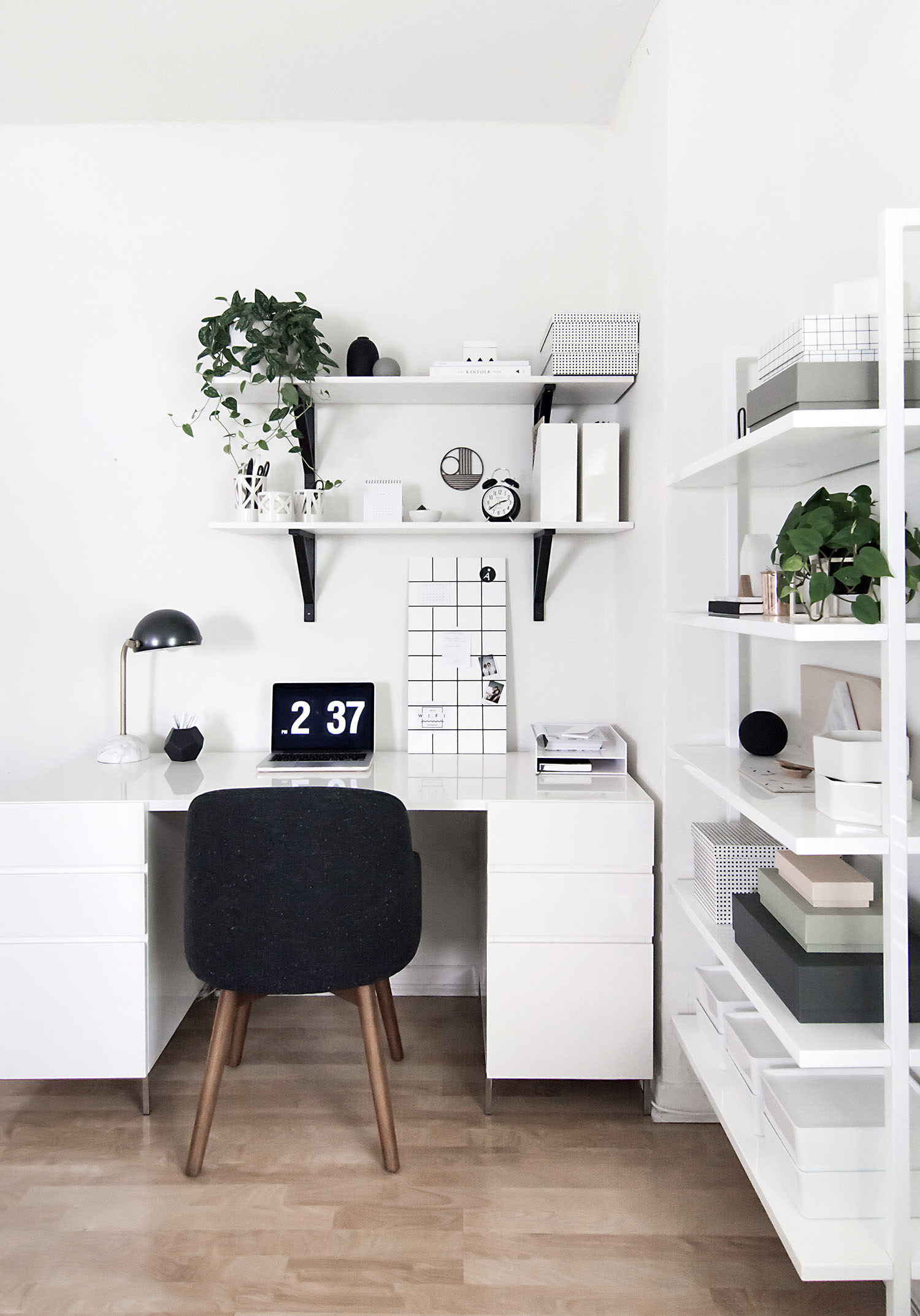
Everyone agrees that inspired work happens in inspiring places, and that’s exactly how I feel about my little corner workspace. It has come such a long way in what felt like a really long time of difficult decision-making, mostly over decluttering (favorite). I’m still working hard on my goal of making sure every single thing in this home is useful or something I adore, and this workspace is a really good example of a win in that direction for me.
Something fun: a couple of the things here were DIYs that I’ve shared here on the blog. If you missed them, check out either the memo board DIY or the mini plant stands DIY!
This post is in partnership with West Elm. Thank you for supporting brands that help bring you new and inspiring ideas!


I am in love with that chair
Girl. Me too.
looks great! This give me hope that I too can organize and purge my way to a sleek minimalist decor. I love seeing you’re evolution!
Yes it’s taken a lot of time to get here and I’ve never been good at the minimalism thing. There’s hope for all!
Gorgeous Amy! You are such a styling pro!
Thanks Rachel <3 <3
pinned this for later! decluttered and monochromatic is my ideal workspace too.
Ah, glad we can relate ;) Thanks, Danielle!
Love this, super zen! great inspiration thanks for sharing
Thanks so much, Arianna!
That’s a really bold workspace! I love the monochromatic look cause it’s super classic, clean and stylish without being overboard. The dark green plants were a nice accent of color naturally. This is so perfect! Thanks for the ideas!
Thanks, Alicia! You said it well, it’s bold but not loud, exactly what I wanted ;)
Such a gorgeous working area you have! I’m really jealous.
It all looks so chic and beautiful.
http://tealattewithstyle.com/
Aww thanks, Emma :)
i’m in love. amazing color.
Thank you!
Gorgeous and clean, and totally fits your style! You’re light years ahead of me in minimalizing (is that a verb?). Looks so good, though–I’m inspired.
I mean it only took me almost 2 years so… it takes time!! Thanks girl, appreciate your stamp of approval <3.
This is such a serene and elegant workspace Amy!! I absolutely LOVE what you did with the space. It feels very functional and useful but still airy and open enough to think. I can never think quite right in the midst of clutter and I’m a total sprawler too. Awesome work as always lady! xo
Lee!! Thanks so much girl. You totally get me.
Amy, wow. This is just too beautiful. I love to see how your style has evolved since I first started following your blog. You are now the QUEEN of the monochrome look, yet you make it look warm and inviting instead of stark and cold. Well done, girl, it’s truly gorgeous!
Marlene you are too, too kind, like terribly kind. Can’t thank you enough for the encouragement.
A couple of other people have already said this, but it has been fun to watch your style develop. This new workspace is just beautiful and so you!
Ah, thanks Alexis. You’ve been there pretty much since the very beginning haha <3
ok, I might just need you to come up and help me style my work space!!! beautiful!
I love the muted colour scheme and all the white, I love bright spaces!
I’m the same, I like to have papers, a glass of water, my laptop and everything else spread across a desk (organised of course :P)
And yes, I believe you’re most productive when you’re inspired and a great workspace can definitely do that for you xx
We’re clearly on the same page <3 Thanks, Maya!!
Hi! Where did you get the white boxes on the bottom shelf of your storage? Thanks!
Hi Marilynn! They’re from IKEA, you can find them here
Love the graphic black and white boxes! Are those still available anywhere?
I got them from Target over a year ago and pretty sure they’re no longer available!
I love your flooring. Could you please tell me the name of the wood please?
Unfortunately I don’t know. I live in an apartment and it came with these floors!
Here’s my dilemma with my home work space, where the hell do you hide a big fat printer/scanner and all it’s annoying cables?!
Yes, this is my dilemma too. Before I kept the printer/scanner on my desk and the cable was not an issue to hide since it just went down behind the desk, but that thing was taking up too much space and I have multiple printers so I put it in the opposite corner of the room for what’s kind of a printing corner and it isn’t the prettiest. I’ll have to tackle this issue- thanks for your question!
Hi! I love your work space! Where did you get your shelves?
Sorry, shelves about the desk.*
above**
Hi Jessica! They’re from IKEA.
Hi! Gorgeous and inspiring space!! Where is your wall shelf unit from?
OMG!! I love this black an white color mix.. Awesome Job…
Where did you get that desk from ?
From West Elm, it’s discontinued unfortunately.
i love this! where did you get the white container on the bottom of the shelf?
Thank you! From IKEA.
Hey! That’s so beautiful design. I read that you got that desk from West Elm. But is there any more places where I can find similar desk?
Love the look. esp the small white plantholders. Link?
What are your recommendations for white wall paint? I need something bright but not too stark for the office/guestroom and something crisp but on the warmer side for the main living areas.